Our new adventure begins with a move to the other side of the country and a new and vastly different type of home. We bought a 1966 time capsule. We love the vibe and many of the original features, but there are definitely many upgrades that need to be done.
The curb appeal was what drew us to this place. But the placement of that 'A' in our address... "Toast"? HA! See the updated porch here.
I can already see a new house number sign and some lovely foliage growing in that adorable planter. Can't you?
The mid-century built in cabinet at the front entrance is so great.
We love the wood wall in the rather spacious living room, but in both the living room and the dining room those valances and ceiling fans have to go. They are so dated and really do nothing for the room. See an update of the living room here.
The kitchen is so special. The work triangle is very functional, but the appliances are dated. The back splash has mosaic tiles - white with gold. I swear the house I grew up in had these in the bathroom. A bit of nostalgia. See how I brightened the kitchen here.
The cabinet doors need a good cleaning, and the copper hardware is actually really lovely, but it needs to be removed and polished. Oh, and that leg holding up the peninsula... it is literally just sitting there not attached to anything. Oi.
The master bedroom is not huge, but will fit our queen sized bed comfortably. One feature that is in remarkably good condition are the wood doors throughout the main floor. Certainly something that we will celebrate, if not the trim.
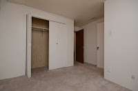
Bedroom #1 is a pretty good size. Simple, lots of potential.
Bedroom #2 is perfect for our 3 year old daughter. The plant in the macrame holder was included. Ha! Well, that fits with the age of the house, I guess.
The main floor bathroom is not a bad size. The vanity is original wood with the original gold-flecked laminate and textured pink backsplash tile, which works well with the pale pink tub. Sometime in the 1970s or 80s, they added a sliding glass door. That and the tile will have to go.
Heading downstairs, there is a great wood railing, that will look awesome refinished. More than that, however, the downstairs is where the retro feel gets turned up a few notches.
Look at that carpet people! And no the fireplace isn't real... and they took it with them when they left.
And that orange vinyl bar! Like seriously. So much goodness in one place. I haven't a clue what to do with this place just yet, but I am sure it will come to me. Maybe a few shots of vodka will get the creative juices flowing?
Bedroom #3 is a nightmare. It is already at a disadvantage by being in the basement, therefore having a small window. Worse, is the gross security gates on the windows. But... it is a bit more of a spacious room. See the update of it here.
Also, the room leads to the cold room which is absolutely the most creepy room in this house. Well, at least we will have a good place to put the dead bodies! Just kidding.
Finally, the downstairs bathroom is unremarkable. The mirror and lighting is not above the vanity, but rather beside it. Odd. A serviceable corner shower will work for now. An instant update will be just to remove the frilly window covering and just allow the natural light to come in through the pebbled glass. See the full update here.
I can't wait to get started, even if it is as easy as a bit of paint. Let the adventure begin!


The cold room is my favorite!!!!
ReplyDeleteOf course you like the cold room, because it is beyond creepy. LOL
Delete