There was one particular article that caught my eye, however. It was called "The Collectors".
The description reads:
"Baseball cards. Butterflies in shadow boxes. Vintage couture. What is is about collectors and their collections? What objects do they pursue and why? Five gatherers discuss their flights of fancy". By Cindy Deachman
Upon perusing it, I recognized someone; my friend and junking confidant, Leila Younis. Of course, I know about her incredible collection, having spent time in her home, but seeing it photographed, en masse, was super intriguing.
As one of the most interesting people I know, I think she was the perfect candidate for this issue. Add her awesome collections of rosaries, vintage landscape paintings, and medical tins - and ding-ding-ding, you have a winner!
What the photos did not capture was the ever changing nature of Leila's space. Her collection is not on display all of the time, like the licence plates on her kitchen island would suggest. Rather, her rooms evolve and change as pieces are added and edited.
Of course, I took this opportunity to ask if I could photograph her home.
Keep in mind that I am not a professional photog, but I think you will still get the gist.
Upon entering her 100 year old Vanier home, the beautiful worn staircase and moody blue wall take the focus.
As an artist and web & graphic designer, Leila has eclectic artwork throughout her home. Some by her, some by other artists, and some found at one of her favorite 'honey holes'.
The wall colour lends itself well to the warm woods in the furniture and in the bones of this house.
This dark-dusty blue was the inspiration for my MCM floor lamp back in this post.
To off-set the dark blue, white walls take up the rest of the sitting room.
Amazingly, the mid-century furniture shown here, are a reclaimed set.
See the Before & After.
The potential was definitely realized in this restoration.
The sitting room is modern with just enough visual clutter to keep in interesting. Unlike cold minimalist spaces, this room makes you instantly feel at home.
A mini-gallery wall gives only a hint of the landscape paintings in Leila's collection.
I love the mix of Ikea shelving with mid-century tables and chairs.
It is this mix-n-match style that gets me really excited. I suppose it is because I strive for the same aesthetic in my own home.
Leila has an incredible eye for proportion, which is expertly shown in her groupings here on the bookshelf.
The way in which the collections are casually placed in the room, creates little stories that add to the overall character of the space.
In front of the sofa is a cabinet that was altered to hold a flat screen with another small vignette, above.
Inspired by chalk-board art and typography, Leila created this fun little piece.
See more artwork on her blog: meltingplastic.com
Moving into the kitchen, the more rustic side of the house is displayed. As a work-in-progress, the kitchen has a quirky patch-work quality that is very endearing.
Originally covered in a mish-mash of different wall papers, as referenced by the window wall, the kitchen is slowly taking on a more cohesive look.
Starting with the wall that serves as the backsplash - Leila used reclaimed barn tin. The effect is amazing.
I also love the hanging chairs - a fun thing I used to do in my flat in London (remember Nicole?).
More entertaining artwork is found here too. I enjoy having artwork in the kitchen, maybe because you don't always see much of it.
Moving around to the wall that houses the stove and refrigerator, more shelving was added for storage.
A great tip, always store things where you use them. Seems like a no-brainer, right? And yet, we often have to go into the craft room to find scissors to use in the kitchen.
I like these pots hanging right where they are needed.
The first time I saw a printer's letter tray, was at Leila's last residence a few years ago. Now, I see them everywhere!
Sooo in love with the pennant. This one, and several others, were made by Leila - including one given to me (in a very touching gesture) to commemorate my years on the Slaughter Daughters roller derby team. I'll admit - I cried.
Finally, a stuffed fox mounts a chalk-board painted refrigerator.
Swoon.
Upstairs! Loving the worn original staircase.
So.
Much.
Potential.
At the top of the stairs, is the first of two bedrooms.
So much to adore.
Vintage suitcases, and a semi-creepy panda (mouse?) collection. They almost look as if they survived the nuclear tests in the desert. There is something intangibly appealing about that.
AND, an amazing Edison light. Su-Per-Cool!
In the newly renovated bath, black & white take over - perhaps taking inspiration from the black & white photos?
I asked if the photos were of family members, and to my surprise, the answer was 'no'; instead they are all found photographs, assembled together in a frame with pins to hold them in place. Perhaps I am the only one who feels this way, but I am moved by this; these people would have otherwise been forgotten, and I feel like they have found a home and a memory here.
A claw-foot tub!! 'Nuff said.
The hallway leads to the second bedroom, and is another fantastic opportunity to display some of the vast collection of artwork in Leila's possession.
Texture in the wood ceiling balances out the wood of the frames and aids in the transition of the ceiling planes.
Moving into the master bedroom, a set of deer antlers sit atop a standing mirror that reflects light back into the room.
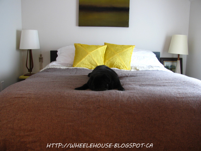
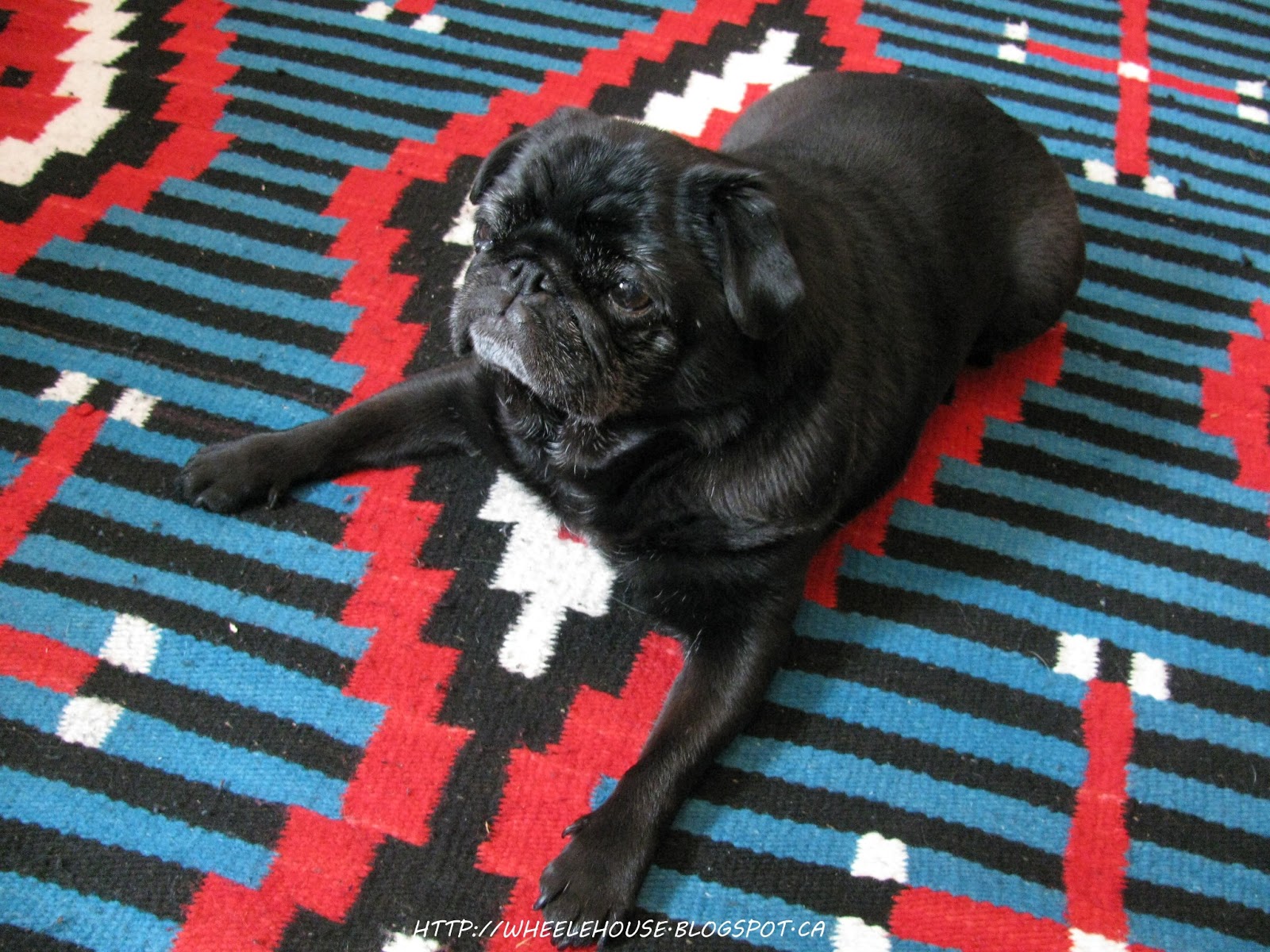
I am absolutely mad for this colour popping Mexican rug. It is sheer genius.
Other than the colourful rug, the bedroom is a serene place. Even the artwork is soothing - ready to take one to their dreams.
Much like my own home, there is a little black dog that is in control of this household.
I introduce you to Ike, an adorable black Pug who is like a little furry shadow.
Ike! Adorbs.
I find this vignette irresistible; especially the cheeky photograph.


I literally don't know where to start - congrats to Leila on an INCREDIBLE home. I want to touch everything. What an awesome and inspiring place. Objects of note - those stairs; shut the front door. They're complimented and preserved so well with the clean navy walls. Typography - I adore all of it. Anything that says the word 'fuck' is down in my books. Little Ike - OMG I can't even look directly at him, he's so cute. All the niches, details, quirky cubbies. I want all of it.
ReplyDeleteWhen I first read 'collector', I thought it would = hoarder and messy home. Boy, was I wrong. What an excellent execution of design and an eye for styling. And a home that constantly changes - variety is the spice of life. Hells yes.
Before I forget, Pat - your photography skills are awesome. Too legit to quit.
Thanks!
DeletePhotography: I have been working more and more on proportion.
Leila showed me a few more things my little camera can do too, which was fun to play with. I need more practice with the new settings, but some worked out. (the larger watermark ones were new, and the small watermark ones were using my tried and true settings)
As for the house - she did an amazing job making it a home. I cannot stress the amount of amazing artwork she has. I don't even know where she keeps all of the ones you can't see!
This is why I love to go junking with her. We have similar aesthetics, but usually different interests, so we aren't fighting over the same pieces.
Her house is DA BOMB!
I want to live there... amazing!! I love everything about it!
ReplyDeleteI know, right?
DeleteIts about as much awesomeness as you can possibly pack into one home.
I can't wait!!!!
ReplyDeleteAlso, we should do McHaffie again in a few weeks.
I tried to get you a few times too...
ReplyDeleteNote: shoulder in first entryway photo & foot in hallway photo!
Ha!
Well done! Pics look great!
ReplyDeleteCharlotte
Thanks Charlotte!
DeleteIt is easy to photograph when a home is this awesome.